Review

Squarespace has a URL formatting problem

I really like Squarespace. Their support of many of my favorite podcast (penaddict, ATP) helps. I have started to recommend and use Squarespace for many of my nonprofit websites (Fiske School PTO). Recently I started to convert some of my other blogs (loftykids.org) over. Immediately I run into a big problem. When Squarespace import (or create) a blog, it requires the blog entries to live under a suffix within the site's URL scheme. For example, the default suffix is "blog". This means all the blog entries will be of the form:

http://mydomain.com/blog/2013/01/fancy-title-1
http://mydomain.com/blog/2013/02/fancy-title-2
... etc ...
http://mydomain.com/blog/2013/02/fancy-title-n

There is no way to not have the /blog/ or /anything/ suffix, for example the following URL is not possible:

http://mydomain.com/2013/01/fancy-title-1

Currently most blog based website removes the suffix and use some sort of date notation only in the URL. The site of Matt Mullenweg, founding developer of Wordpress, is a good example. Squarespace however cannot serves blog pages using this convention.

URL Mapping

Squarespace does have a URL mapping settings, where you can map one URL to another. However the mapping is a literal mapping. It does not support wildcard. i.e. you have to manually enter each page name. So you have to create a long list of URLs and issue permanent redirects for them one by one using this setting option. This is the only solution.

Customer Service

Squarespace always have great customer support. They respond to email or chat inquiries very quickly. This time is no different. I have to give kudos to the customer service reps that handle my inquiry regarding this bug. Stephanie D took my issue and spent a lot of time trying to get a definitive answer to whether this can be avoided with their tech team.

 

1Q84 and Math

I made the "mistake" of picking up ichi Q hachi yon by Haruki Murakami. Of course I cannot put it down. Here is Tengo on Math:

"Math is like water. It has a lot of difficult theories, of course, but its basic logic is very simple. Just as water flows from high to low over the shortest possible distance, figures can only flow in one direction. You just have to keep your eye on them for the route to reveal itself. That's all it takes. You don't have to do a thing. Just concentrate your attention and keep your eyes open, and the figures make everything clear to you."

Beautiful.

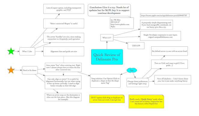
Review of Delineato Pro, a light weight diagramming tool for the Mac

I came across Delineato Pro almost by chance while browsing the App Store. A quick googling around, after reading the developer interaction with his users on macrumors forum, I bought it just to try it out. I wrote the review with it as you can see below. For the search engine: I recommend giving a try, especially if you are frustrated with the complicated feature set of OmniGraffle, and find pure mind mapping tools too restrictive in terms of layout.

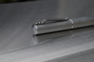
Reviewing the perfect Hi-Tec-C pen, the Render K

I love fine point pens. All my fountain pens are either F or EF nibs. I use Sharpie F points. But I never gotten excited about the Hi-Tec-C and I never knew why, until this week.
After hearing Brad Dowdy and talked about the Render K many times on the Pen Addict Podcast, I decided to get one. Hoping on the  Kara Kustoms website, I saw that they have some limited editions available. Somehow the Raw stock version seems to be the most authentic version for a pen like the Render K, so I ordered one.

The Render K is everything it is suppose to be. A beautifully created pen with all the right lines and precision construction. I popped an old Hi-Tec-C refill that I had into the Render K, and I suddenly find myself loving the Hi-Tec-C ink. Then I realized why: I really dislike light weight pen. The standard Hi-Tec-C is the worst -- both light weight and thin. That is the reason I never liked it. Now with the weighty Render K, I really like writing with the Hi-Tec-C 0.4 mm refill now.

Note that this is a special raw stock edition. The body is deliberately not polished. I happen to like the look. When you buy a regular Render K from Kara Kustoms, it will look beautifully polished.

Kindle is still better than the iPad, for reading

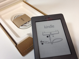
Instructions on Power Up I love my iPad. There, I said it. It is with me 50% of the time. I consume media on it, Zite, Hulu, Netflix, Safari . I connect with it, Facebook, Twitter, Hootsuite, Mail. I write on it: iThoughtHD, iA Writer, Notability. I even read Kindle books on it using the Amazon Kindle app. But when it come to reading books, I still like the real Kindle ereader better.

The Kindle is better for five very important reasons:

  1. The e-ink display is wonderfully usable even in sunlight. A person who like to read, like to read outside. iPad does not work.
  2. The Kindle is light. The iPad is not very heavy, but the weight difference is significant when you are holding it to read for a long period of time.
  3. The Kindle battery last a long time.
  4. The Kindle is cheap(er) than the iPad. I would feel much less annoyed if I damage or lost my $99 Kindle Touch than my $700 iPad.
  5. The Kindle is more robust. It is much less likely to damage the Kindle then the iPad, when taking places.

What prompted me to write this blog post? I just came back from a short cabin camping trip for four days. I took my iPad and my Kindle Touch with me. I never once took out my iPad. I carried my Kindle everywhere, and caught up with a lot of reading. Sitting under a tree reading from the Kindle. Much better than the iPad.

I look forward to the anticipated new Kindle announcement next week. I am pretty sure I am going to get one. But I hope they bring back the hardware "next page" button.

English Public School is American Private School

This used to confused me when I started living in the States. I went to an English public boarding school, which would have been called a private school in America. Why the opposites? I found a good answer while reading Jeff Jarvis' Public Parts, a book on the impact of sharing and being public in the age of the internet. The definition of Public, prior to the early modern period, was synonymous with the state. Only men of official stature were public. English non state run schools, usually for the privileged, are call public school. Similarly, the common soldiers, the ordinary man without rank, is a private.

WordCamp Boston 2012 Review

Serendipity

This year's WordCamp Boston went off with an interesting start. I got there about half an hour early, grabbed a coffee sat down at one of the tables in the keynote area. After chatting with the only other person at the table for a bit, something sounded strangely familiar. When I mentioned I lived in the South End, she figured it out. We sat almost at the exact same spot, during breakfast, and chatted at last year's WordCamp. What are the chances?

Introvert

The opening keynote speaker was non other than Diane Darling the famous FFI and author of The Networking Survival Guide, and "how to work a room". She gave her usual funny and insightful talk about how Introverts can still network effectively.

Stylesheet Preprocessors

First session I attended is "How we can have nice things" by K Adam White. My main take away was the benefits of using a stylesheet preprocessor, like SASS or LESS. I know of LESS from the bootstrap CSS framework but have yet to try it. Now there is a reason to try it. One thing that I wish LESS support is the @extend feature, which would allow clean rule inheritance in the CSS.

To make any of these work, one should get node.js working on your desktop environment so that you can run javascript at command line.

Wordpress Optimization

A talk on Wordpress Optimization by Ben Metcalfe, co founder of WP Engine, which also which gave out the coolest t-shirts at this unconference. He gave a useful set of recommendations:

A funny fact is that he listed a list of plug-ins to avoid -- things like broken link checkers. Later on, in another session on SEO, another speaker recommend using the same plug-in. Ben is right of course, broken link checking should be done outside of WordPress.

Wordpress as an Application Framework

This talk was not what I expected. The presenter created a piece of code to allow PHP code to access a global (singleton) object, which is useful for adding more functionality to Wordpress. But that is far from being an application framework. Is is more in the line of -- if you want to stick with wordpress and knows PHP, this is one approach for writing more custom PHP code.

Content and more Content

After lunch I switched track and attended the sessions on content and SEO. Jeff Cutler gave an entertaining talk about the process of creating content.

  • addictomatic, a search aggregation site (like duckduckgo) is a site that I didn't know about, and
  • the importance of an editorial calendar -- I know I should use one, but now I am convinced.
  • YouTube, storify and instagram seems now to be "valid" channels to consider when cross posting content

SEO

No wordpress conference would be complete if I did not attend a session on SEO. I sat in on a session by Casie Gillette . She recommended a few tools that I did not know about:

  • Screaming Frog's SEO Spider
  • sharing plug-ins: sharebar and sharaholic
  • Google authorship markup is all the rage apparently, it is a way to have Google recognize your blog posts with you as the author, showing your picture alongside search results. The authorsure plug-in is one way to handle it.
  • related posts link using YARPP

Podcasting

The last session that I attended is Guerilla Podcasting by Lanna Lee Maheux. She makes a good case of using a podcast specific hosting service for the podcast because they will charge by size vs bandwidth. If you have a successful podcast you will be paying bandwidth costs if you host the files at a normal hosting company. Libsyn, buzzsprout and blubrry are the three sites that she mentioned.

Final Thoughts

Due to scheduling conflict I had to leave wordcamp early. There were other sessions that I wanted to attend. All the sessions were tapped and should be available online. Overall I like this year's program better. I still think there are one SEO session too many. I wish they have more case studies instead.

Kindle Touch Review, from an iPad2 User

Executive Summary

  • If you are a serious reader, even if you own an iPad2, buy the Touch.
  • If you have a child who loves to read, buy the Touch.

Background

I own an Amazon Kindle 1, aka the White Wedge. I used it quite a bit until the battery stop holding it's charge, and I got an iPad2. I do almost all of my book reading on the iPad2 using the Kindle App (how ironic). However the weight and the glare makes the reading experience sub par. One cool thing that I can do however is to flip between the Kindle App and iThought HD (a mindmapping app) to make notes while I read.

I pre-ordered the Kindle Touch when it was announced and it arrived yesterday. Charged it up in about an hour, and it is ready for use.

Likes

  • It is small and light, something that you can "throw" in your bag and have your books with you anywhere, bonus: much lighter than the iPad2
  • Page turn delay, which is always an issue with e-ink display, is not bad. Check out the video review I made, basically it is quick enough not to be bothersome.
  • The on screen virtual keyboard is also very responsive, meaning you can make notes easily right on the device

Dislikes

These are all minor issues:

  • The charging port, which is a micro-USB port, feels loose. I hope it does not break in the future
  • The feel of the plastic body is not great. I cannot tell why, but it just does not feel nice, especially compare to Apple products
  • Similarly, I which it comes in a sharper color, but then that's what cases and covers are for
  • no landscape viewing mode (at least for now) -- I do not find this to be a big problem, but people using the Kindle for reading personal PDF may find that an issue
  • When you click a "button", it does not "flash" -- so there is no visual feedback of a button being pressed. This is something that, say Apple, will never let go. They should either turn the button dark for a moment or have audible feedback, considering there will likely be a delay until the action is taken. (Note: The keyboard has this "flash/dark" feature. Only buttons in dialog boxes do not.

For Video Review click here to see my video on Amazon.

More Tips and Issue

Amazon Account Management

We use the Kindles within the entire family. One question is whether to use one single Amazon account for all content? Or split them up into adults vs kids accounts. This is a problem that would be solved if Amazon allows a easy transfer of content between accounts, but they do not. This is how the "book" metaphor breaks down. We are not allowed to give our books away. Since we may want to read each other's books, we choose to use a single amazon account. As a result, we need to:

  • disable auto-syncing so that two people can read the same book at different speeds without all devices automatically jumping to the furthermost point
  • use collections to organize a larger than necessary set of books

Listening to Music from iTunes

I am a Mac user and all my music are stored within the iTunes / Apple ecosystem, as DRM free Apple Lossless format files. the Kindle only support MP3s. So I need to convert any music that I want on the Kindle into MP3 files. iTunes has this feature but it may not be obvious.

Kindle Touch for Kids

The Kindle Touch is a great device for kids who read.

Final Thoughts

Summarizing the bigger points regarding the e-book and digital living marketplace:

  • Amazon should allow ownership transfer of e-books. This is solved in the music world by the removal of DRM in music files.

Day 7: iPad Stylus is a must

I decided on Dan Bricklin's Note Taker HD as my note taking app. It is an amazing app with a lot of features, including:

  • free hand input
  • free hand input with shapes
  • a zoomed mode that allow you to write in a larger space (hard to explain, go try it)
  • PDF annotation
  • image annotation
  • and much much more

It is by, I would say a software artist, Mr. Dan Bricklin of VisiCalc fame. What's not to like? However, I was having a tough time writing on it with my finger. I was at Office Depot and I decided to pick up the only type of stylus they have, the Targus stylus. This is the rubber tip type, not the foam tip type. I actually like this better, and now I can really make hand writing notes on the iPad.

Day 6: Using the iPad in a Business Meeting

I used the iPad in a meeting today. We usually bring up documents and websites on the projector to review. Since I have the iPad with me, I decided to give the iPad try. I click open an email containing a powerpoint, click on the powerpoint, and it shows up immediately. My co-working came over and sat next to me. We look at the iPad screen on the table and work through the powerpoint presentation. We also needed to check a few competitor's website. Quick launch Safari, type in the site, and we are off. Observation: The iPad invites collaboration. We sit side by side instead of across a conference room table. This calls for a friendlier and more informal meeting. It is almost like back-to-paper. We can point and click on the iPad screen together, instead of passing the mouse back and forth with the traditional laptop and projector setup.

The iPad is a good meeting facilitator, for a two person meeting.

Day 5: Sorting out NPR and PBS on the iPad

There are too many apps for NPR and PBS, for iPhone and iPad. I spend half an hour cleaning up all the apps. There are two pair of apps that are useful:

  • The official PBS (tv) apps published by PBS, for iPhone or iPad
  • The official NPR (radio) apps published by PBS for iPhone or iPad

The NPR (radio) apps both let you do live streaming or catch up on old shows. The Video program has selected content for viewing, but obviously no life streaming. These apps are confusing because they use the same icon for both iPhone and iPad, but the apps are different. On first sync I have both versions on the iPad and I need to launch them to figure out what is what.

There are other apps out there, the Public Radio Tuner will stream radio, and WBUR has their own apps. But I am not sure if they are necessary if you have the official apps.

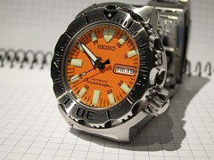
Review of the Seiko SKX781 "Orange Monster" Automatic Dive Watch

Old is new again. Part of the geek cred is to appreciate watches. Form and function -- What's not to like? I went from super thin swatch purchased in Tokyo, to my first "expensive" watch, the Bell & Ross Fusion, purchased at London Heathrow's duty free shop, to a series of G-Shocks, perhaps reflecting on practicality of the last few years.

I was all ready to continue my G-Shock / tool watch collection with the PAW 2000, the "gentlemen's ABC Watch (That is Altimeer, Barometer and Compass) -- the ultimate in the sports tech watch. 20+ functions. More raw computing power than my first computer. Then I stumbled upon the Seiko automatic dive watches. Automatic meaning the watch is automatically wound as you move the watch about with the natural movement of your arm. Yes -- this means the watch is a pure mechanical device. No quartz, no battery, no solar power, no radio sync. It's all stainless steel enclosing gears and springs.

A pure mechanical watch. The Seiko SKX781  "Orange Monster" Automatic Dive Watch. 7S26 movement.

The Appeal

I never like flashy watches. Oversized watch falls into that category. That's why I never liked them. These dive watches are large and thick but not overpoweringly large. The only thing that this particular model is the orange face, which will catch your eye if you look closely. But it is not a "look at me" type of loud.

Without the flashiness, the remaining stainless steel look is more utilitarian, more industrial, more modern. That of course is ironic since this is a design from the 70's. Very much like the minimalist / industrial design that is hot now. Old is new again, for the better.

First Impression

The watch arrived in a proper watch box, with a pillow holding the watch. What presentation! Even the more expensive G-Shocks comes on a plastic holder inside a cool tin box. This Seiko is old school all the way.

The Weight -- this thing is heavy! It is several times heavier than the G-shocks. It bothered me for about five minutes, and then I don't feel it anymore. In fact I like the weight now. Because of the weight I wear it a little tighter than I wear the G-shocks, and it actually feel good. It feels like part of my arm now.

The manual operations

I must amid, wearing the watch across the end of November period and realized I have to manually change the date from Nov 31st to Dec 1st was a slight annoyance. But like most manual tool, it is a way to bond with the tool. There is a relationship between the user and the tool. It requires care and feeding. It is not "use and forget".

Adjusting the Band

I will detail the process in a separate post. Basically I purchased a few cheap tools from the internet and adjusted the size of the watch band myself. It was much easier than I thought. Now the watch fits like a charm, even on my small 7.5 inch wrist.

Now I am saving up for the next classic Diver, the Seiko SKX007. Not to mention the joy of finding alternate watch bands.Reference:

For more information than you need on this and other Seiko dive watches, read this article.

[AMAZONPRODUCT=B000EPLR2G]

WebEx Totally Blew the New Customer Experience for Me

I signed up for a new WebEx account today for a client. Got onto the WebEx website, clicked through the sign up forms, gave them my credit card for the $468 annual plan, thinking I can immediately scheduled a web conference with a new sales lead. But No... 11:21 am: The last screen in the sign-up process tells me that it will take up to 30 minutes for them to setup my account. In the age of 5 seconds attention span, "do it now" mentality, I am already unhappy. In this specific instance, I actually need to schedule a conference with a customer *now*. Not happy.

11:28 am: "Receipt for you WebEx order" email arrived. Which tells me please allow for 30 minutes for my account to be setup.

12:12 pm: "Welcome to WebEx" email arrived. (that's 34 minutes later) saying I can start using WebEx.

12:13 pm: Trying to log into WebEx using my email address as the user id, which was *repeatedly" mentioned in all the emails so far, no luck.

12:14 pm: Trying to reset / retrieve my password, no luck. At this point it is cleared that something else is wrong. Signed on to their online chat to ask for help.

12:15 pm: Oh you are an existing customer? Please call our 800 number.

12:16 pm: Called 800 number, someone picked up, determined that "something is wrong, your account is invalid", and transferred me to another department.

12:21 pm: after waiting for a few minutes, the call dropped. (We will *not* blame WebEx for this one, it could be just the cell service).

12:21 pm: Call back, since it was "something to do with my account", I navigated to billing and not tech support. Waited and waited.

12:29 pm: Agent picked up, "oh you need to talk to "service" and transferred me again. More waiting.

12:40 pm: Can't wait anymore. Hung up. Went to get lunch downstairs.

12:50 pm: Eating lunch at my desk, called back to 800 number, navigated to "tech support", and, yes you guessed it, waiting in the queue.

12:57 pm: Someone picked up. "Oh you don't have a user name" he says. "Funny I thought it was my email address" I replied. He asked me to pick a user name, (not in the form of an email address), created my "account" and away I go. I asked why did the system from the first sign-up screen keep telling me that my email address is my user name?

He couldn't explain. Seems like perhaps there is a truly manual step involved in the WebEx account setup process, and someone is suppose to type in a user name for me.

Wait -- this is not over !!!

10:35 am THE NEXT DAY: I got an email: "Your meeting center user name and password" is created. That is about 19 hours later. And that it seems is in response to the customer service rep's setting up of my user name when I was on the phone with them.

Recap

If I had simply waited, perhaps 19 hours later I would have received my actual user name? What is the actual rules for user name? Email? or username? What exactly is the sign-up process? I really would like to know.

By the way, I tweeted my dissatisfaction on twitter to @webex. Someone responded several times, but nothing actually happened.

Irony

The irony is that I was a very early user of WebEx back in 2000 when they were starting out. I have used it extensively in a global start-up. Everything was first rate. This experience makes me want to go run to dimdim or gotomeeting.

Broher MFC 7840W wireless network multiple function printer review

For the new office I need a new printer. Specifically the requirements are:

  • works well with Mac and PC
  • works well with Linux a plus
  • need a copier function -- we don't print much these days, but we do have the occasional copy need, copying sketches made in meeting for clients for example
  • reasonably fast
  • laser instead of ink -- ink is too expansive to run
  • wireless so that I don't have to worry about placement

Verdict

I settled on the Brother MFC-7840W. It is an older model, and a mid range machine. Has all the usual features including network scanning. The verdict? B++. You can often find this discounted to about $250. A high yield toner cost around $40.

Likes

  • machine is reasonably well built, still lots of plastic parts of course, at this price point
  • print fast, print quality is good
  • works easily with Linux, some of our developers are happy
  • works with mac, I am happy
  • copier works

Minor Dislikes:

  • network scanning is so slow that it is not usable (I expected this before buying it). Use my wonderful Fujitsu ScanSnap instead.
  • The Mac control center software (not required) while works is ugly and not friendly.
  • The wireless connection would fail every few days, requiring a quick power off/on on the printer -- this is the only real annoying part. Have not troubleshooted this one yet.

Over all, it works and I am happy with it. See some pictures below, notice how many little blue tapes it used in packaging.

[flickr-gallery mode="photoset" photoset="72157623758889121"]

Snap Circuits SC 300

My love of electronics and computers, which defined my career, can be traceback partially to having a electronic building block toy when I was very young. Back then, we do not have Snap Circuits. The toy/kit that I had was more powerful and less user friendly. You can only buy that kit as a specialty item in Japan now. It is part of the Otona No Kagaku series, meaning "science for adults". There is a website that you maybe able to order one. Mine is the old version of the EX-150. A similar Germany version is still available at Lectron Electronics.

Anyway, back to the easy way -- Snap Circuits. When I looked at the pictures I never thought it was any good. It definitely is on the simple side on the electronic circuits that it builds. I gave one of these as a Christmas present to someone and I got a chance to play with it. I was surprised that it was a pretty good kit. Very easy to "use". So it is well suitable for younger kids, as an introduction to basic circuits. You can find the manuals online to check out the kids.